Preacher Wakesurf
Naming and brand identity for the Canadian wakesurf board company. Staying true to the company's ethos, "Inspired by the Ocean, Created for the Lake," the name "Preacher" originated from the spiritual benefits of surfing and the belief that nature is healing and sacred.
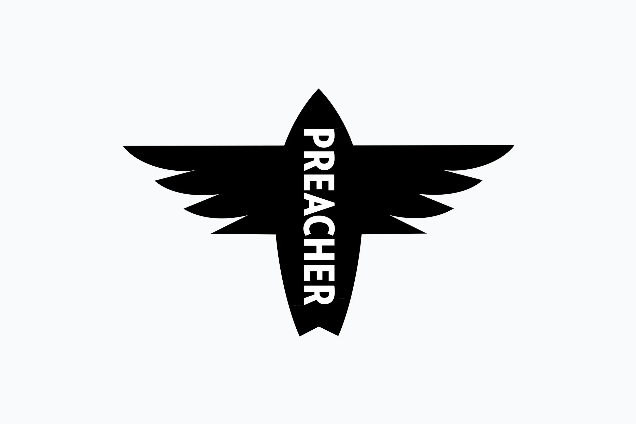
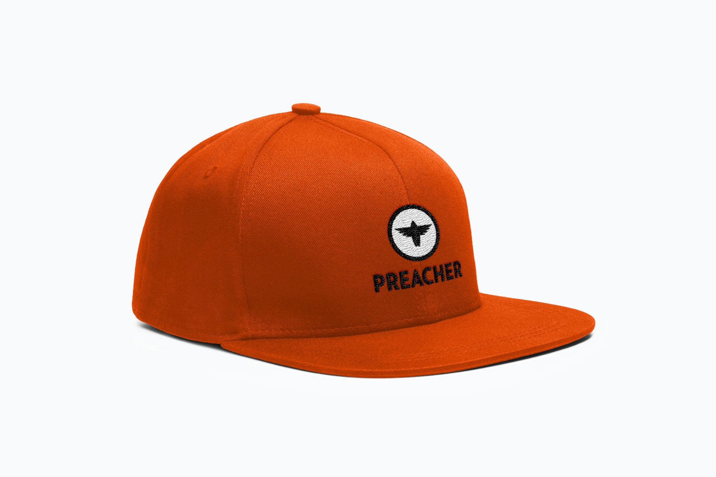
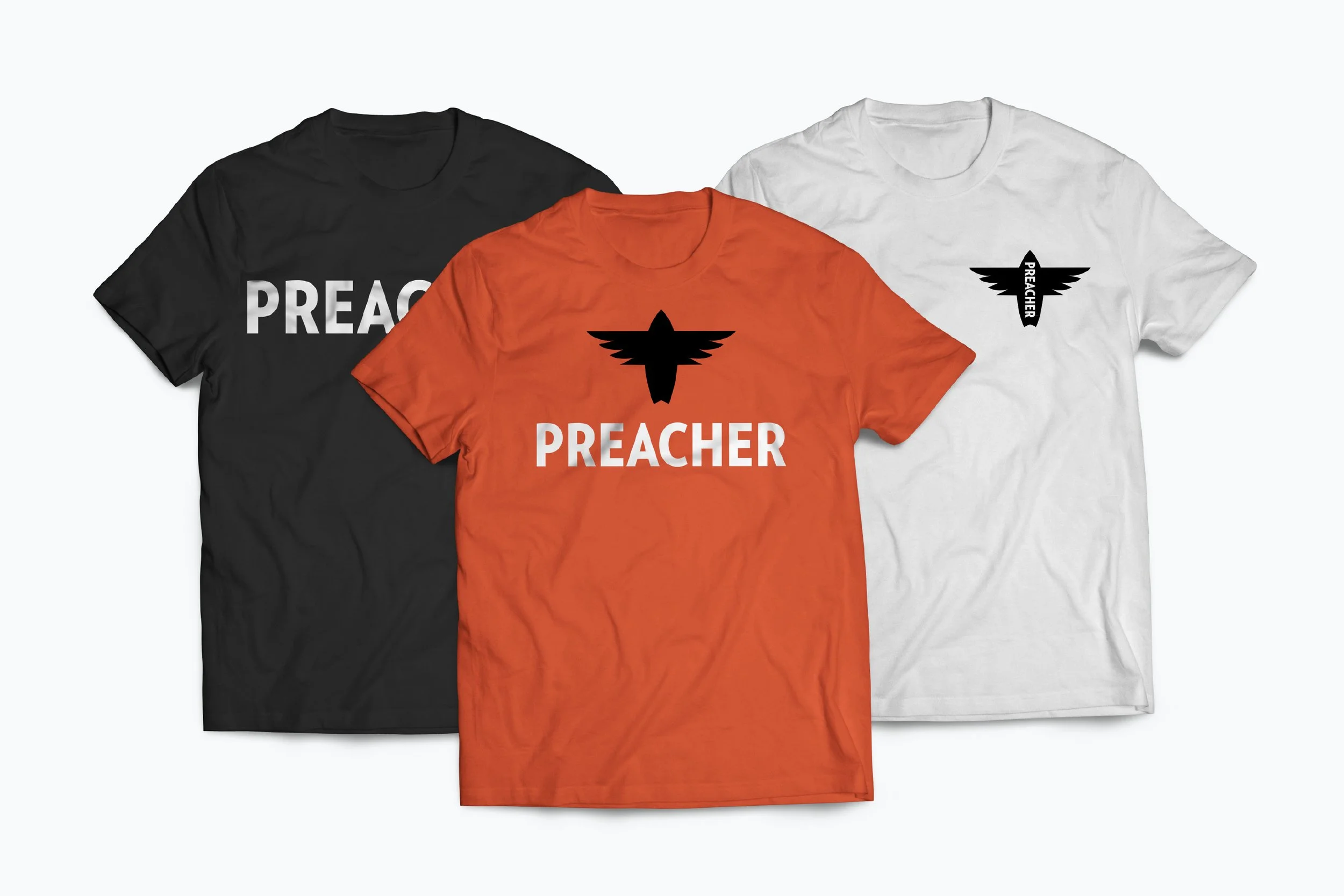
A simple black icon of a flying, swallow-tail surfboard resembles a cross but also incorporates the distinctive wings of a crow – a bird with a lot of religious symbolism.


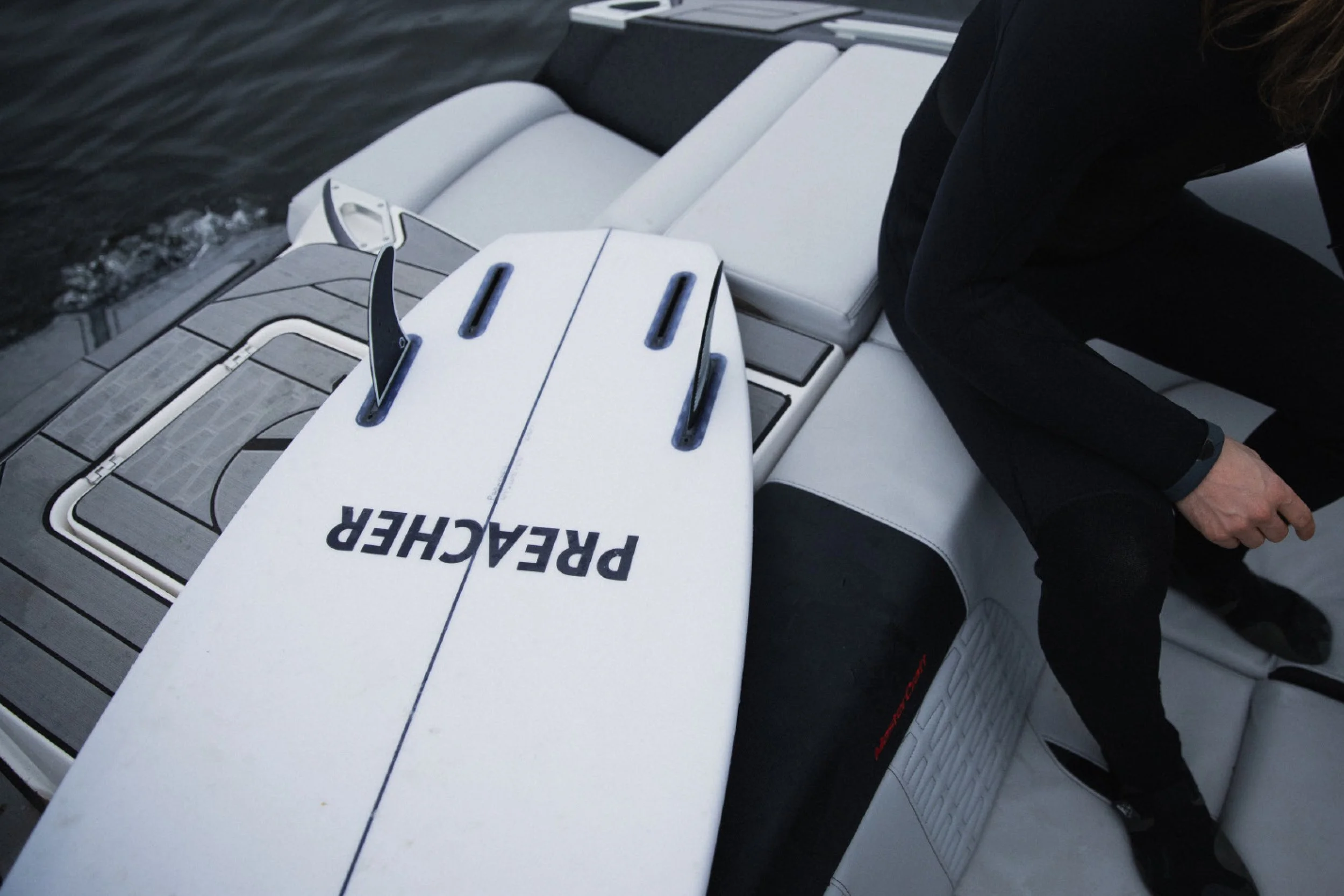
Every detail was meticulously chosen, from the materials used to the cuts and accessories, to make these wakesurf boards feel like ocean surfing on the wake.


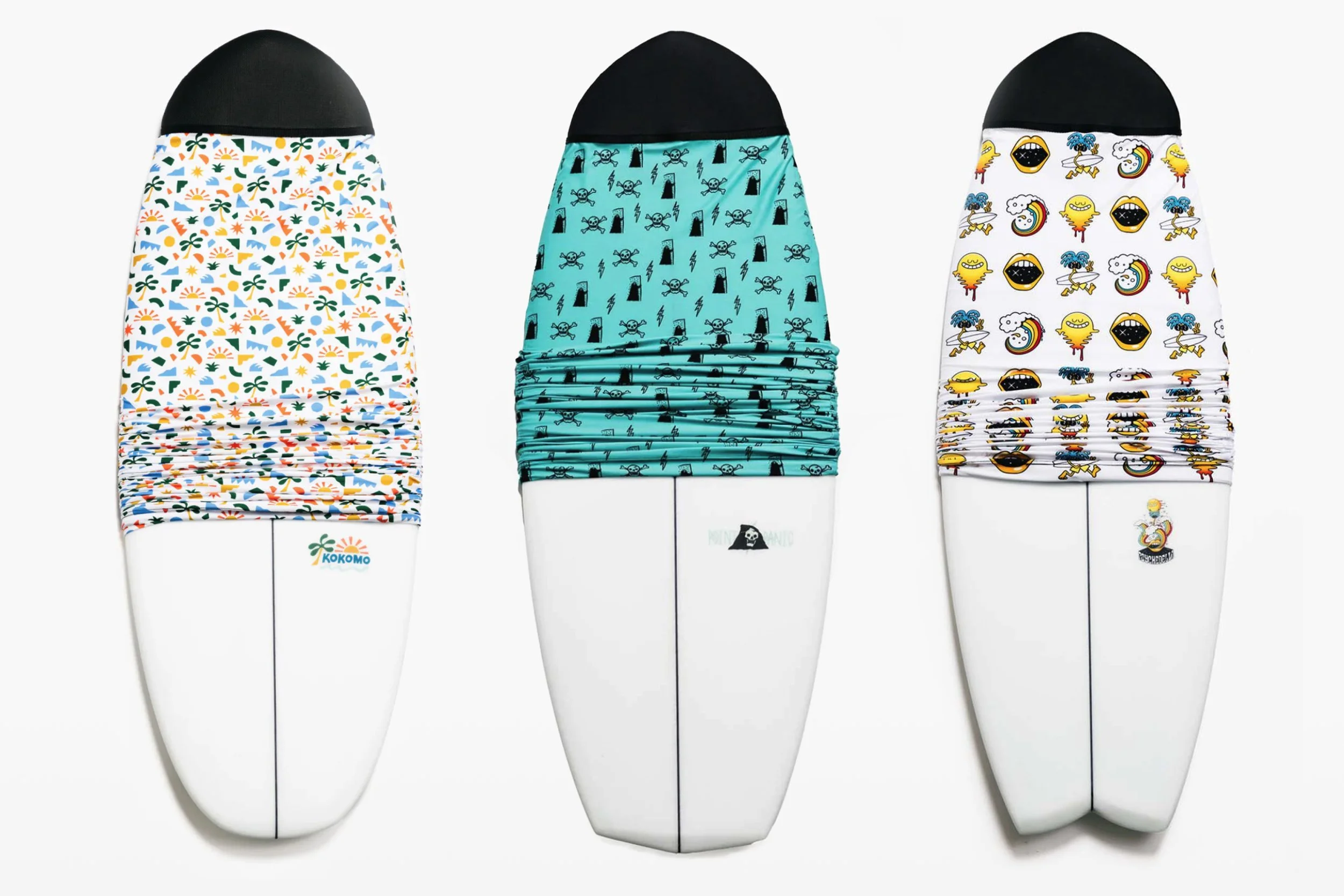
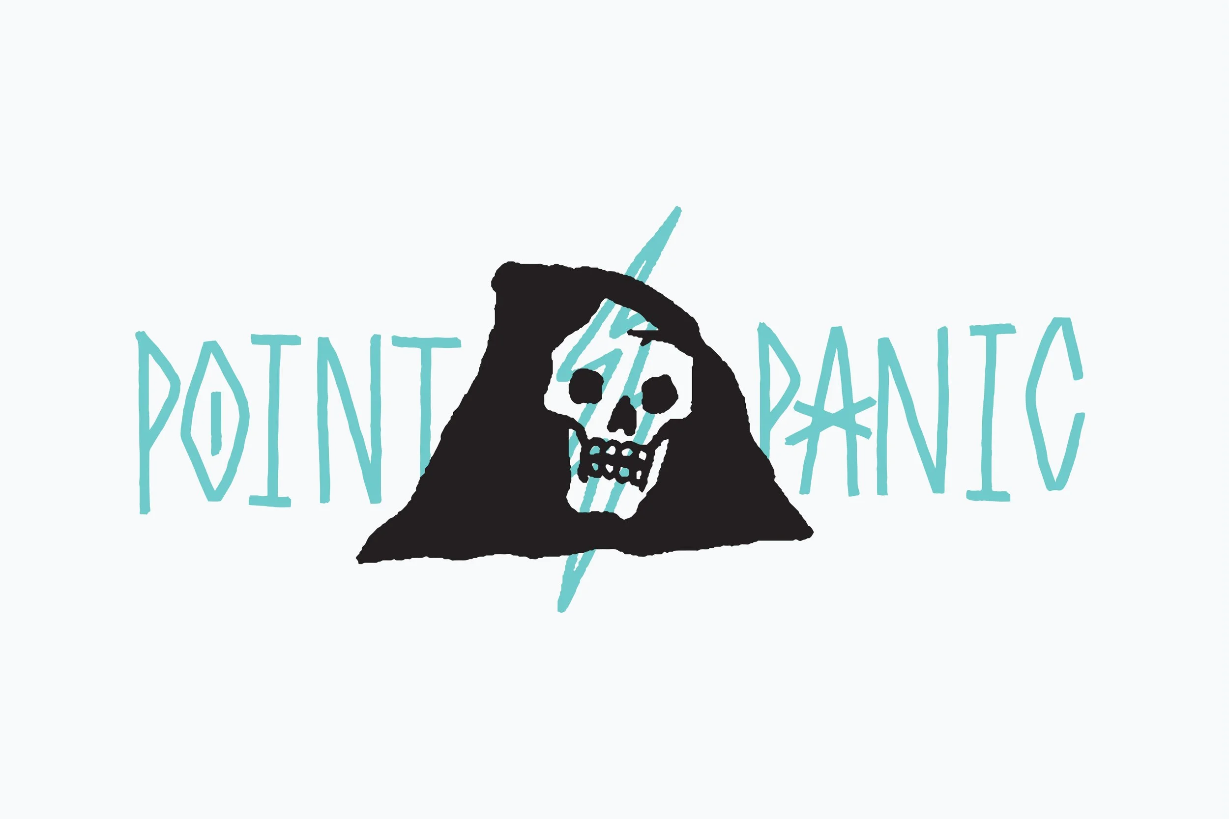
Preacher offers three models of boards – Kokomo, Psychedelia, and Point Panic – with distinctive contours and tail shapes. Each model is given its personality with additional graphics.
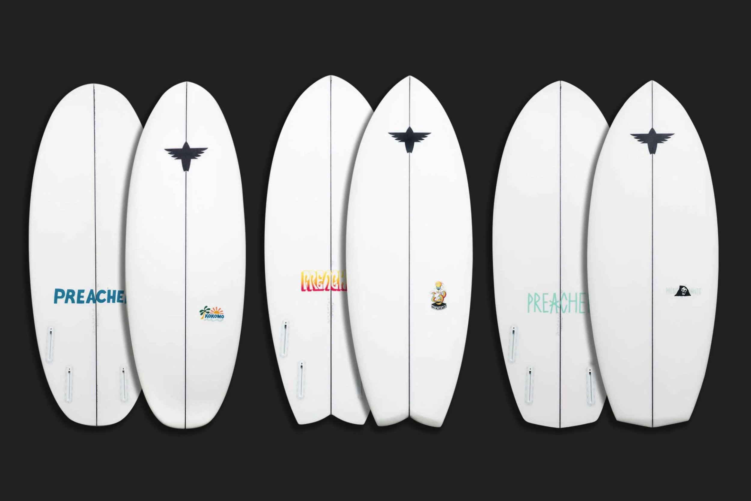
A different artist was commissioned to create a signature illustration and typographic interpretation of the Preacher wordmark for each board. Will Bryant did the graphic for the Kokomo model, Jon Contino for Point Panic, and Mark Ward for Psychedelia.


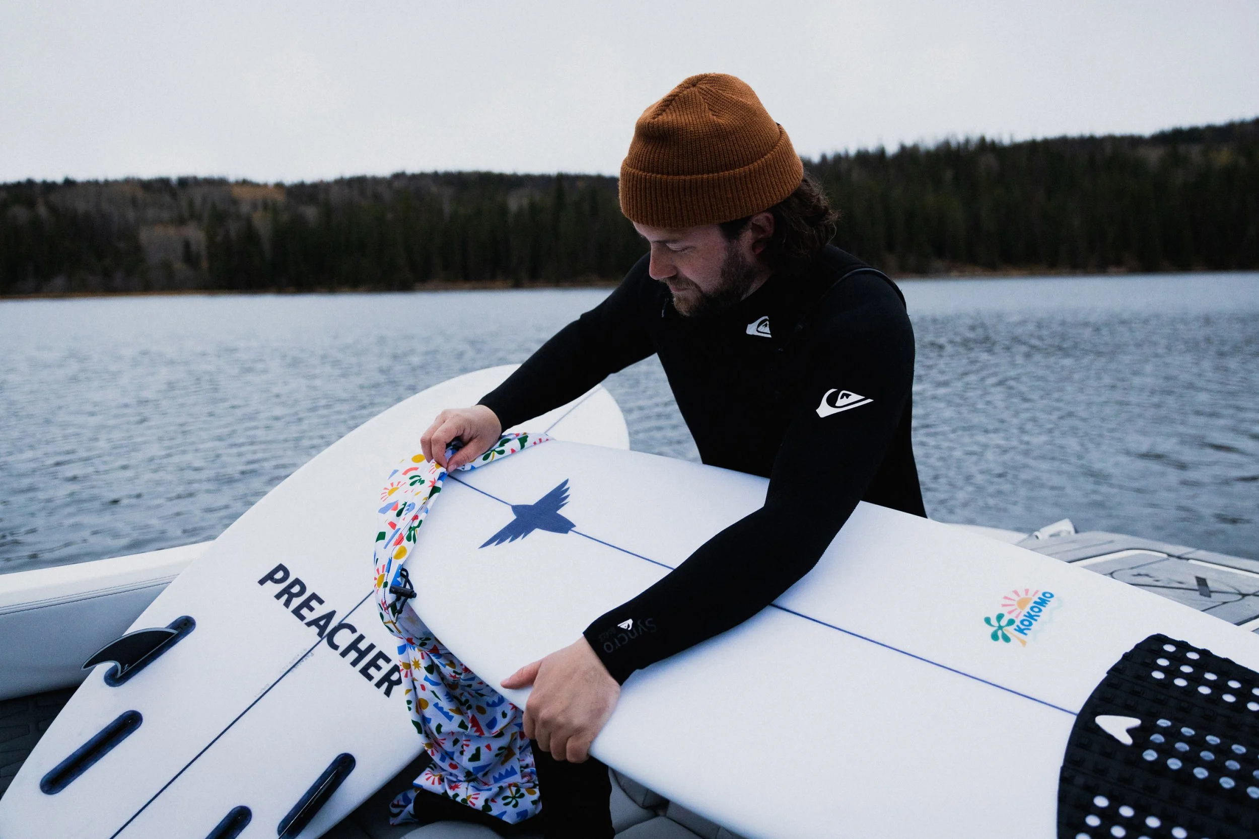


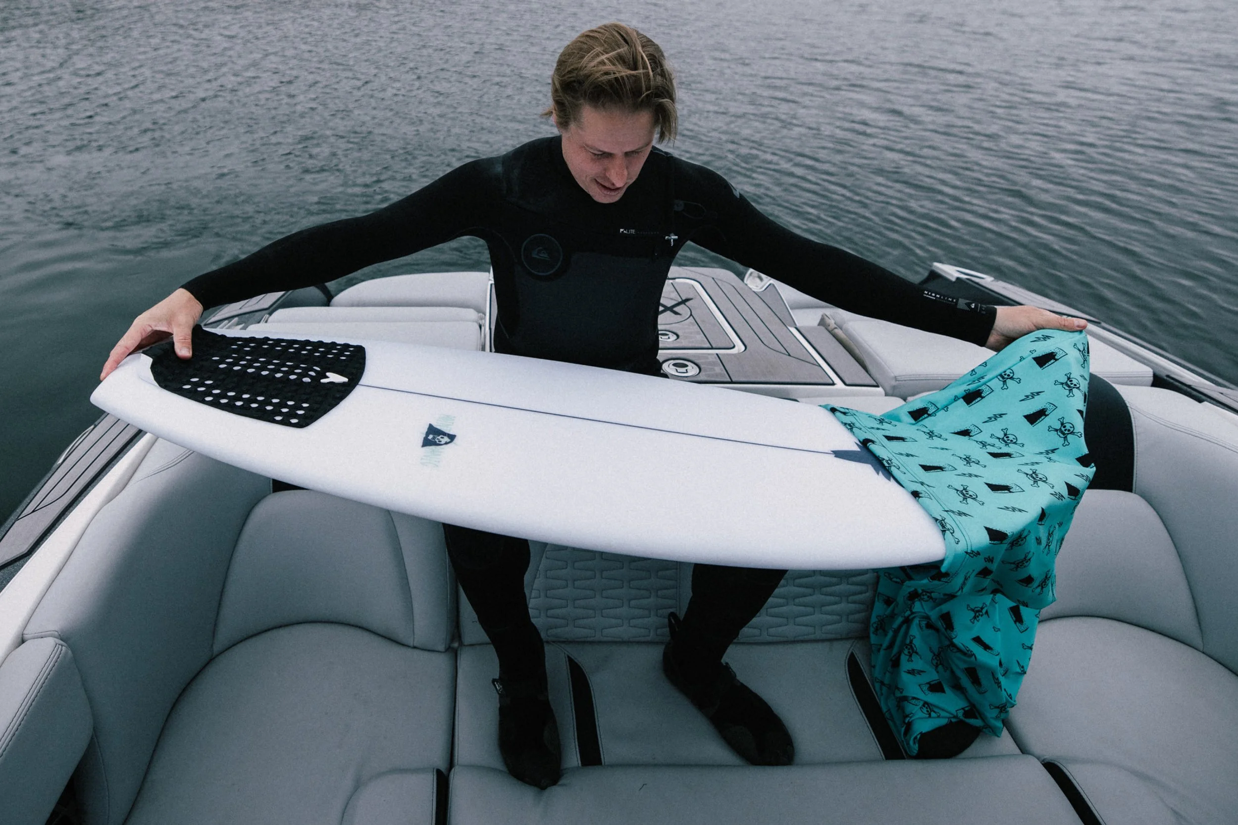


Each artist was given free rein to create custom board socks – an idea borrowed from high-end golf clubs. The socks protect the boards in transit and storage and add a quality, collectible aspect to the Preacher brand experience.